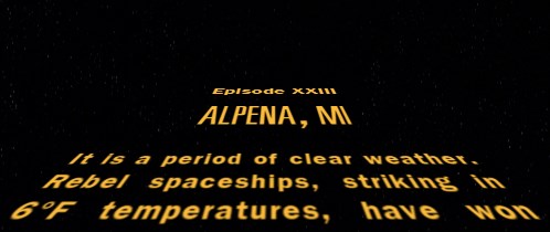
The Star Wars opening crawl has been replicated many times in HTML/CSS. It's almost a rite of passage for frontend web development students of a particular geekly persuasion. I threw my hat into that ring several years ago, and made an exacting reproduction of the Episode IV crawl (though never published it). I recently re-visited that project and decided to put an absurdist spin on it by turning the crawl into the most impractical weather report possible. To that end, I've spent the last few days creating this:


Despite the silliness of the project, I feel it can actually serve as an apt demonstration of much of the frontend skillset. There's some fancy CSS3 — transform and animation are used liberally to create the effects, the entire page is responsive thanks to viewport units, and there's a dash of flexbox for good measure — AJAX to fetch the location and weather data, a form with some validation to get location input, and a good deal of JS with jQuery to tie eveything together.
The live demo can be viewed at adamcot.com/demos/star-weather.